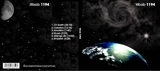
So I stuck with the initial space theme but instead of having a broken earth, I place a side view of the earth in the bottom corner, and used linear effect to give it more of a realistic feeling above that I placed a kind of cloudy nebula with a bright star that shines onto the earth.
For the back I have a star field with a moon in the top left hand corner, the text for the CD Tracks is placed on the left. I have used the small barcode and the emit logo place at the bottom.

I have also had to find a different font to use for the logo because I couldn’t find a bolder version I the font I initially used. I search high and low for a font that suited the theme, the font I used is called “Gravitate”, and I downloaded this font from DaFont.
For the past couple of days I had been making the actual CD cover, I had a basic design, a gray background with white text, the logo at the bottom, the Artist and Album Name at the top and I wanted to had the copyright text going round the edge of the CD.
I did a lot of trial and error with this, I finally found out that I had to use the text paths tool, I found this out using the built in help, which really I should have look there in the first place.
My plans for the rest of the week complete my evaluation, I have begun it today but I still have quite a bit to do, I hope to have it done by Friday so I have the full weekend to print out and check everything ready for Mondays seminar group.

11 comments:
I really like the CD cover you've got at the moment, but it's a shame you had to drop the idea of a broken Earth... I really liked that concept.
A couple of issues, though. Firstly, I think the text on the spine should be at the top, rather than in the middle. It looks a bit out of place in the middle, and I don't recall ever seeing another cover like this. Secondly, the image of stars on the back seems to be made up of a lot of squares, and it's clear where these meet. I think to need to try blend these in somehow so the images looks smooth.
I see what you mean, i used a cloud effect in the background and used the Dodge and Burn tools to take it our of some areas, i will need to ajust this, ill post the result later this week.
Hi Liam
I see your design as improved a lot. However like tom said you can clearly see the square images of where the stars have been placed on.
I have had the same problem before messing with lighten and darken tools and using various blending options such as hard light and color burn.
Thanks, Martyn
Your design has improved vastly since I last saw it and it looks a lot better. As Tom said I’m not sure about the artists name been in the centre of the spine and with the track listing next to it, it looks like it should be at the top or bottom of the spine.
Just one other thing you haven’t included the logo on the back of the CD case and where are you intending to put it, because I’m not sure what you meant in the post.
To be honest, I thought your original design with the broken earth has more scope than this new design.
In order to get rid of the square that surrounds each group of stars use a layer mask.
Good work Liam, Im realy liking the progress you have made. The CD cover is coming on great. But do you think it may be a good idea to have the star theme on the spine of the design?
Also its great that you intend to finish everything by friday (today), giving you the entire weekend for checking and printing. I on the other hand dont wont have it all completed for today. But I have the weekend of work and im sure I will manage to complete the remainder of what needs to be done in that time.
Your design has improved so much since I last saw it in class, I'm quite surprised at how good it's turned out given the earlier attempts. Yeah I agree with some other people that the concept of a broken earth was a stronger one, but the execution of this concept is to a much better standard and works as a cover so much more.
Did you try Martyn's qubism effect on the back of the CD cover? cause thats kind've how it looks. I'm not sure if this effect works for the images you've made, I suggest taking them off and reverting to the original back cover, I do like the placement of the listing though, nice work.
The only thing I would change is that I would align the tracklisting with the artist. Other than that it's looking good.
I have to agree with james on that one!
I really like it though, looks like this mac business is doing you good!
Id also be careful about your typeface on the album/artist.
Which is which? I think it is commonly the Artist name which is bolder or larger.
Post a Comment